Scrolling – good for fingers but not for SEO
November 17 2021
As a Content Strategist I’m on a mission. The brief I’ve chosen – to keep up to speed with what’s happening out there in web development land. I make sense of how it will impact on SEO and what this means for my clients and collaborators. Today we’re on a voyage for the parallax.
Website developers often find themselves with a quandary: they can build a website that looks great but will perform badly for SEO. The software Flash was once such a culprit. It’s code didn’t much help search engines with indexing and ranking. Often it was built without unique web pages so creating inbound links were a massive issue and it was always slower to load webpages built in Flash. All major pitfalls for SEO building
The brave new world of the parallax
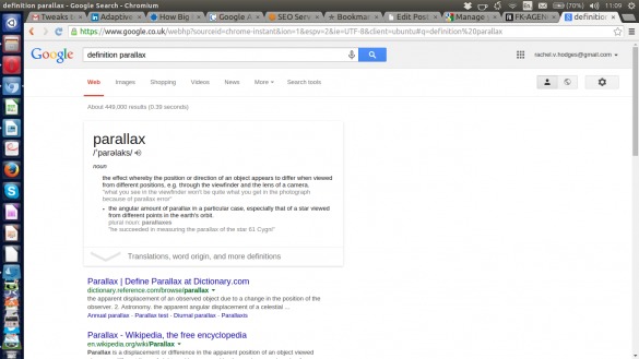
With Flash’s day over, the past few years have seen a massive growth in ‘parallax web design’. This coincides with the unprecedented uptake of tablet computers and smart phones, where it’s all about the scroll. So, before we go any further let’s have a quick dictionary definition.
parallax
ˈparəlaks/’
noun the effect whereby the position or direction of an object appears to differ when viewed from different positions, e.g. through the viewfinder and the lens of a camera.
In website terms, parallax web design offers stunning design opportunities, a comfortable user experience but they’re not great for SEO. Often they are built using just one URL or web address that doesn’t change wherever you are on the site.
See what I mean by looking at this website from France, http://www.fk-agency.com/. The clickable links at the top of the screen jump you down to the services ‘page’ but notice that the URL hasn’t changed to http://www.fk-agency.com/services. To search engines, everything appears on one long website.


The perils of the parallax
I was recently asked to complete an SEO audit on a website. First look revealed that the same URL was appearing on every page. A web developer chum of mine confirmed it was a parallax site and although it wasn’t built to look like it, all the content was on one long page. From an SEO point of view, this was pretty much the end of the road for the client.
With all content competing against itself keyword selection was impossible, as was in-bound links to key areas.
For me, and at this stage in parallax development, I’d think twice about the themes you choose for your next website. Bare in mind how traffic is finding your website at the moment. Can you really afford the cost of a new website as well as a drop in those finding you through your SEO? Maybe parallax should be kept back for those ‘special projects’, where it’s all about the look.