How to write web copy that’s great for users
November 17 2021
(Refreshed 5 May 2022)
Writing for the web has some similarities to its sister method of writing for print. The interests of the reader still need to be right up there as a must have, everything written should be crafted to engage the reader and share information, the chosen tone of voice must sound like the business it’s written for and big ideas or detailed concepts broken down into manageable and understandable chunks for engaging and information sharing.
So, all that’s a given. But, there is also a lot about writing for the web that’s unique to the medium. With much of it backed by some pretty cool science. Let’s look inside some of the bigger concepts of writing for the web.
The best way to get down the details
When writing for the web it’s time to think like a journalist. Take a look through any physical newspaper or an online news story and it’s plain to see that they front load the information. What this means is that all of the attention grabbing details are put right up front and they tell us all about the:
- WHO – should your page appeal to, what should they know about you from the off
- WHAT – the product/service/offer/update do you have to give them
- WHEN – any timely aspects to your story, how long you have been in business, when does your offer expire
- WHERE – is your location important, are you open 24/7
- WHY – any USPs, or must-know details to be shared
- HOW – a call to action, how to be involved, benefit, replicate by customer
This is the information that the reader needs to know straight away. It’s the hook if you like and that’s the same for any web page. Each page needs to do what it can to hook the reader to stick with every word until they read to the bottom of the page. And there isn’t long to do this – some researchers say just 2 seconds.
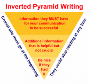
When writing for the web picture yourself applying the science of the writing Inverted Pyramid. There are lots of images of this online and the one below gives you the idea of how to plan web content browsers will want to read.

Once the must-have information has gone in at the top think about the text tier of details that could be shared. What is there to support what’s already been stated? Again, think like about the resources a journalist would use. What’s available in terms of testimonials, photos, statistics, graphs etc that could reveal that bit more and encourage the reader to keep reading the page. Remember, readers are free to go at any time and explore elsewhere online so messages need to come across clearly and concisely to hold human interest.
Don’t take the proportions of the pyramid too literally.
Here’s a quick outline of things to keep in mind when using the Inverted Pyramid:
- There doesn’t have to be twice as much space in the first paragraph as the second. In reality, the full detail of the page is more likely to happen in its middle section
- The opener wants to be strong, rich in keywords and not too long to help overall page and site SEO
- Calls to Action can be anything from downloadable documents, to email addresses and link through to other pages in your website. Don’t leave them as an afterthought to be included at the very bottom of the page.
- It’s worth repeating links within long pages to ensure they are not missed
It’s all in the eyes
Newspaper and magazine printers have known for years that where something sits on the page affects how much it is seen. When turning a page for the first time our eyes dart around taking in all sorts of visual clues to absorb what they’re reading. Put something in the wrong place and it could get missed.
The same can be said for webpages. A good name to look out for in the world of website usability is Jakob Nielson. He’s a consultant and researcher into human-computer interaction and has been pretty much since the birth of the world wide web. Check out the Nielson Norman Group website for all sorts of fascinating facts on how we interact with our screens.
A lot of the rules about how web text should be written and constructed feed back into eye-tracking research carried out by Nielson. So, what’s eye-tracking? It’s where web users, wearing sci-fi looking head gear, have their eye positions studied while viewing a screen. After a number of people were assessed researchers began to see patterns in their behaviour. Understanding that has helped define some of the conventions used in web writing today, giving website designers insight into how people engage with sites to improve human/technology interactions.

Via NeilPatel.com
What’s in a face
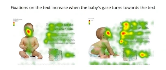
Look at the two baby images. The same text and design have been used in both, the only difference being the position and eye-line of the baby image sitting in – on the left they look out to the reader, on the right their gaze goes up to the text.
See, from the red heat mapping of the left image, people spent longer looking at the child’s face than at the text. There are some hotter yellow areas in the heading and the stand first paragraph, but no other red zones. When the baby appears to be looking at the text then there are significant changes. The child’s face still gets lots of interest but so too does the heading and stand first, with warmer orange areas appearing in the body text and down to the call to action. The eye has been redirected to spend more time on the text.
Knowing we can influence where people look online should be part of your writing for the web.
Seeing patterns before our eyes
Research that was first undertaken by Nielson around a decade ago and then refreshed fairly recently shows that we still read much online content by applying patterns and following certain cues. And, this is still the case even though small screen usage on mobile phones continues to rise over desk-top computers.
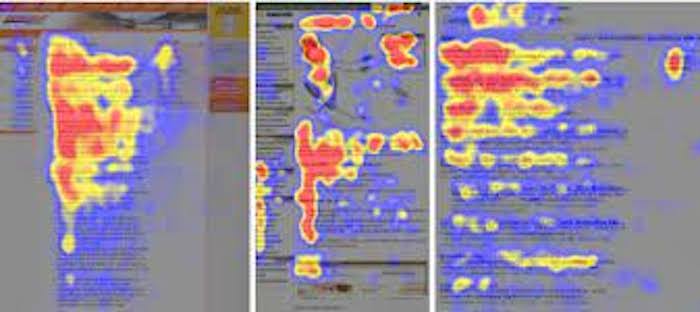
One of the first popular reading models which appeared through eye-tracking studies was our interest in the F-shape. The heat-maps below from eye-tracking studies show the F-shape in action.
For written languages that read left to right it became clear that we mostly skim read down the left hand side of the page. Then, our eyes can always be encouraged to track right when we see something of interest. Pulling us to the right could be a heading, a photo, a pull quote or a comment box. These are all devices to help our eyes linger and keep us engaged with the page.
It’s clear that users will continue going down the page, almost bouncing from noticeable section to noticeable section, if it holds their interest. Theoretically this should continue until they reach the very bottom but typically reading peters out before you get there. So, here’s another good reason why the writing at the top of the page is so important for hooking the reader, with content lower down helping to keep them reading for as long as you can.
The pattern of the F-shape also emerges as a reverse F-shape in languages where people read right to left. Over the years, other patterns have emerged but the F-shape still seems the one to beat.
Remember, there isn’t much time to engage your readers before they click away. So engage. Don’t be shy about using techniques to bring your pages to life. Work with web designers that know a thing or two about website usability. Then, pair these tips with what you already know of your audience and sector to make your writing for the web a must-read experience for every vas strong as possible.

